Aug 13, 2019
Designing a College Campus based Buy and Sell App

IMG: Information and management group is a software development group at IIT Roorkee that develops software systems and niche applications which empathize with the residents of IIT Roorkee, making their digital stay as easy as possible. Channeli is the intranet portal for the students and faculty of IITR.
Why buy and sell?
As students, there are a lot of articles that we have to use for just one semester (drafters) or at specific times (trunks while changing rooms or hostels). Students also prefer to sell their belongings to residing students at the time of graduating. With Buy and Sell, IMG aims to provide a common online platform for prospective buyers to be able to find interested sellers and vice-versa.

Buy and sell was an existing app on channeli and I was given the task of redesigning it.
Problem: The existing Buy and Sell app had a murky navigation system and unclear organisation. With Channeli being redesigned and redeveloped, it was a great opportunity to ideate and improve upon the existing app.
Research
Analysing the existing website
Being a student of the institute as well as a member of the user base, I analyzed the app and drew some assumptions based on how I, as a user, would interact with this app. I also talked to some of my peers to understand their grievances and qualms from the app:

User Survey
To verify these conclusions and to test the feasibility of some of the features, I decided to conduct a survey.
Survey: The primary challenge I faced while forming a questionnaire was to make sure I received genuine responses. It was important that I do not coax a response out of the respondents or lead them to a specific answer. To avoid these issues I made the survey completely anonymous. The questions included were not aggressive or judgemental to make sure the respondent won’t feel attacked and fill an ingenuine response.
The primary users were the students of IITR and to understand what motivated them to sell their objects and what were their concerns while selling or buying stuff online, I circulated a Google form. I hoped to find the utility of an option to “Rent” an object temporarily not in use such as drafters etc.
Insights drawn:
- A lot of students buy articles that are useful for only a limited period of time and are willing to sell it. The primary motive behind selling an item is that it of no use to them followed by the money one might make out of it.
- Since the number of people checking channel-i feed was very low, the probability of a person coming across a request post on feed their for something they have and are not using is very low. Moreover, the primary motive behind selling an object was because it was of no use to the seller, hence the utility of the request option was low.
- People were apprehensive of lending their objects to unknown people when they had to use it again, so the utility of rent option was low and it was not implemented.
Deciding on the features
- Based on the data collected from the survey forms, “Item for rent” feature was not implemented since users were reluctant to lend their items to strangers if they had to use it again.
- Even though the utility of the “Request” option seemed low, about 30% of all the items listed were in the request’s section. I decided to keep this feature because of it’s substantial user base.
- People willing to sell an article or request one can do so by filling a form, submitting which their item would be added to the list.
- If a user looking to buy a specific article could not find one for sale, they can add a request for that and add the category to “Watching Category”. Whenever an article would be added to this category, the user would receive a desktop notification.
A user account consists of:

Deciding the information architecture
Two kinds of users would use this app:
- Those looking to sell/request for an item.
- Those looking to buy an item.

- Navigation: One of the problems with the older design was the navigation between categories which was in the form of a dropdown which hid relevant information and added an unnecessary step in navigation. Another was the confusing mix of categories and sorting options in the same drop-down. I decided to separate sorting and ditch the drop-down and go for a navigation bar at the top of the page.
- Organisation: The organisation should be such that the user can easily understand the importance of each element and its hierarchy. For example, the same categories were to be present in both items for sale and requested items. Therefore, it was placed below the toggle between them. The size and weight of information on the cards implied their importance as well.
- Searching: I decided to have a global search at the top. Upon entering a word, the results would be presented in a drop-down along with whether the item is being requested or is for sale. Upon clicking, the user would be directed to the page for that article.
Wire-framing
Once I had a picture of how I wanted to present information on my website, I started the wire-framing process. Initially, I used a pen and paper before moving to Figma.
Deciding on the navigation
I started with side navigation which was quickly shot down because it couldn’t convey the hierarchy and took too much unnecessary attention and space. I decided to go with top navigation with a sequential organisation. Upon seeing the screen, the user can make out that all the categories are under items for sale or requested items.

Card structure
I had to include relevant information in such a way that the card didn’t end up looking too crowded. I read a couple of articles and discussed with other designers and came up with the final design. The name and the price along with the image of an item are the things that are most interesting to the buyer and so I gave them more emphasis.

User account
User account is the place where the user can find all their uploaded items and edit or delete them. The categories watching can be updated here as well.
User Interface
Initial iterations
I started with basic wireframes and iterated upon them based on feedback from fellow designers and other users. Once I was satisfied with the wireframes, I moved on to working on the mockups.

Final Screens

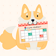
Logo
I was also tasked with designing the logo for this app. I was given a few constraints to work with according to the common theme for all the logos on Channeli. The basic idea was to have a square logo with a minimalistic design.
I considered two options:
I finally decided to go with the second one with a price tag. It retains its shape and is easy to identify even in smaller images compared to the shopping cart image.
What I learned
- I learned how to form questionnaires and conduct surveys. I used small, direct and simple questions to make it easier for the user to answer them. I used Google Forms to conduct the survey as most of my target user base were most familiar and comfortable with it.
- How to analyze data collected from a survey and utilising to make key decisions with regards to features in the app.
- I read about information architecture and the best practices to follow while conveying information. Since the primary motive of this application is information dissemination regarding objects available for sale, I got to learn a lot while working on this project.